Choosing the right colors for your design can be one of the most influential yet challenging task for designers, especially with presentation design, where legibility is strongly emphasized. Slides with proper choice of color palette are not only more eye-catching but also assist viewers to understand the content of the slide.
So how do we know which colors look good together?
In this post I will present you with the basics of color theory and give you few tips to help you choose the right colors for your next design.
Basic color theory
Color theory plays a vital role in design. The knowledge of color theory is pursued by artists and designers for decades. However, the basic color theory is something that everyone can learn and apply.
Best of all it is not only about choosing colors for your design but you can use it in your life e.g in choosing the perfect outfits. A good insight into color theory will definitely help you to be more confident in exploring the color world.
Color wheel
As you may know from school, colors are formed from three main colors, which are Red, Yellow and Blue. They are called primary colors.

When mixed with each other, they form 3 different colors: Red and Yellow make Orange, Yellow and Blue make Green, Blue and Red make Purple. They are the secondary colors.

Tertiary colors are the ones when you combine the 6 colors you have altogether, you will expand your color world, and eventually, end up having a color wheel.
Hue, Tint, Tone and Shade
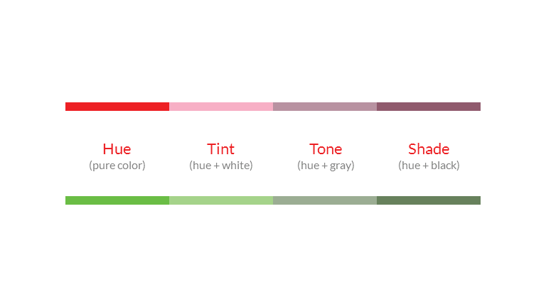
There is definitely more colors than the colors you have on the color wheel at the moment, because you can create more by mixing the original colors with white, black and gray. It’s when some specific terms such as Hue, Tint, Tone and Shade come to your color world.
Whereas Hue is the synonym to the word “color”, ranging from primary to tertiary colors; Tint is the color you’ve got when adding white to the original color. In contrast, Shade is the color you’ve got when adding black. Tone can be achieved when combine the original color with gray.
RGB and CMYK
The color model I described above is called RYB color wheel, which stands for Red-Yellow-Blue. However, there are two other significant color models you should know, and they are even more common nowadays – RGB & CMYK.
Have you ever wondered what are the differences between RGB and CMYK?
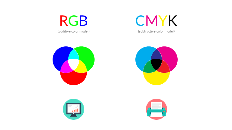
RGB (Red-Green-Blue) is quite similar to the RYB, the only difference is the Yellow has been replaced with Green. RGB is an additive color model which can be used on electronic displays. When mixed altogether, they form the pure white, which is the reason for the name of additive colors.
CMYK (Cyan-Magenta-Yellow-Key Black) is the color model used in printing. You may notice on every color printers, there are symbols of 4 ink cartridges which are Cyan, Magenta, Yellow and Key Black. They are called subtractive color model, because it is the opposite to additive color model: The more colors you have, the closer you are to black, instead of pure white as the RGB.
Color Harmonies and Color Schemes:
Now you have already obtained the basic knowledge of the color world, the next step would be to choose the right colors that look good together for your design. You may find it tricky at first, but when you’ve come to know about the color schemes, everything would be much easier.
Monochromatic Color Schemes
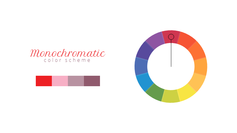
This means using a color palette created from one color with its different shades and tints. Although it is a safe and easiest way to choose colors for your design, it quite lacks contrast and it is not so good with attracting attention.
Analogous Color Schemes
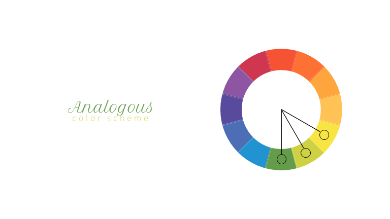
Analogous color schemes are used when you pick one color, together with two other colors next to it on the color wheel. It is not very good to show contrast either, but it can create the mood for the design, for example, when used together, yellow, red and oranges can create a very good feeling of warmth, or autumn.
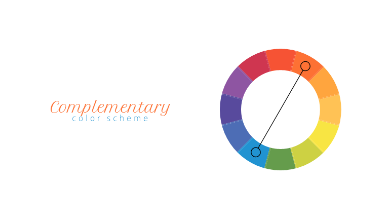
Complementary Color Schemes
This can be formed by using two opposite colors on the color wheel. Red and Green, Orange and Blue, Yellow and Purple are some noticeable and classic examples. This can create high contrast for your design, but my advice is that some other shade of colors should be chosen to the palette, especially for the color of the background.
Split-Complementary Color Schemes
This formula is the same with the Complementary, except for the fact that you would choose the colors on either side of the complement. This will create contrast as the Complementary does, but you will have more options. However, both these schemes can sometimes be hard to balance.
Triadic Color Schemes
Triadic color schemes use three colors that are evenly spaced, creating a perfect triangle on the color wheel.
Tetradic/Rectangular Color Schemes
You use this scheme when choosing four colors which form a rectangle on the color wheel.
Meaning of colors in Marketing & Branding / Color Psychology
Now you’ve already know about what colors look good together.
Next thing I suggest that you should take into consideration when choosing color for your design is what kind of emotions you want to evoke. Each color has a psychological mood attached to it, which can show passion, elegance, fresh, warmth or friendliness.
You can use the grouping below to pick the main, dominant color that you want your design to convey. Then you can use one of the color schemes above to create the supporting colors for your color palette.
You can also apply the same color psychology in logo design.

Color tools and palettes:
Now you have learned about the basic color theory about color schemes and harmony. Is there a quicker way to choose the right colors for design than staring at the color wheel all the time?
The answer is yes.
There are many tools on the Internet, which use not only the theories about schemes but also creators’ tastes to create color palettes for you. Normally these sites will also provide you with HEX or RGB codes to directly copy them to your own designs.
Adobe Color (or Adobe Kuler): https://color.adobe.com/
You will either create your own palettes with the color wheel on the site, or explore numerous palette from others.
Colour Lovers: http://www.colourlovers.com/
Millions of color palettes are waiting for you. Besides, you can also find the patterns that go with the palette so that you could also use them together in your designs.
Canva’s Color Wheel: https://www.canva.com/colors/color-wheel/
Canva provides the interactive color wheel, and different color combinations are also available. By choosing one color from either the wheel or the hex code, and choosing the color combination you want, you will receive other colors that should go well with the original colors.
Color Supply: http://colorsupplyyy.com/app/
You can experience the color wheel and all the schemes again, and there are also examples of these colors when go together to help you decide if they bring the perfect mood to your designs.
Color Palettes: http://colorpalettes.net/
Another option for Color Lovers, however, things get a bit more difficult because the site doesn’t provide you with the HEX or RGB codes.
Are you enjoy reading about design?
Check out this other blog post about The Ten Commandments of Good (Presentation) Design by John Zimmer to have a wider understanding thus managing to create better design.

