Simple and effective presentation visuals can have a great impact on overall quality of a presentation. However, a presentation is more complex a creature than just presentation slides and therefore a graphic designer does not always equal a presentation designer.
Before I turned into a full day presentation designer, I worked as a sales and marketing manager. In that job I created print, webpage and banner design with graphic designers. I also understood that hiring a graphic designer to help with a presentation can often bring all kinds of difficulties along. Some examples included:
- Mistaking presentation template design for custom presentation design
- Mistaking print design for presentation design
- Not involving the customer in the design process early enough and (in worst case) becoming insulted for critical feedback
- Not understanding PowerPoint and delivering PDFs or images as the end product, which makes it difficult to adjust the presentation
Here are some further advice on what you should ask for, when you seek for help with your presentation.
Garbage in, garbage out – a presentation designer helps you to develop the content of your presentation
Graphic designers are usually not trained or willing to structure and polish presentation content. No amount of graphic design can make your presentation persuasive, if you have too much content and it is random, unstructured, and the overarching story is missing.
Studies show that audiences understand and retain more information from a presentation if it has a structure. Therefore presentation design starts in the content creation phase and whoever is responsible of the presentation graphics should be involved already at this point.
Based on experience, the biggest design decisions are made when you decide what goes into the presentation and what doesn’t. If you want your presentation story to be persuasive and understandable, you should also expect ideas for structure and content from your design partner.
Presentations are not print – a presentation designer adapts the design for the presentation medium
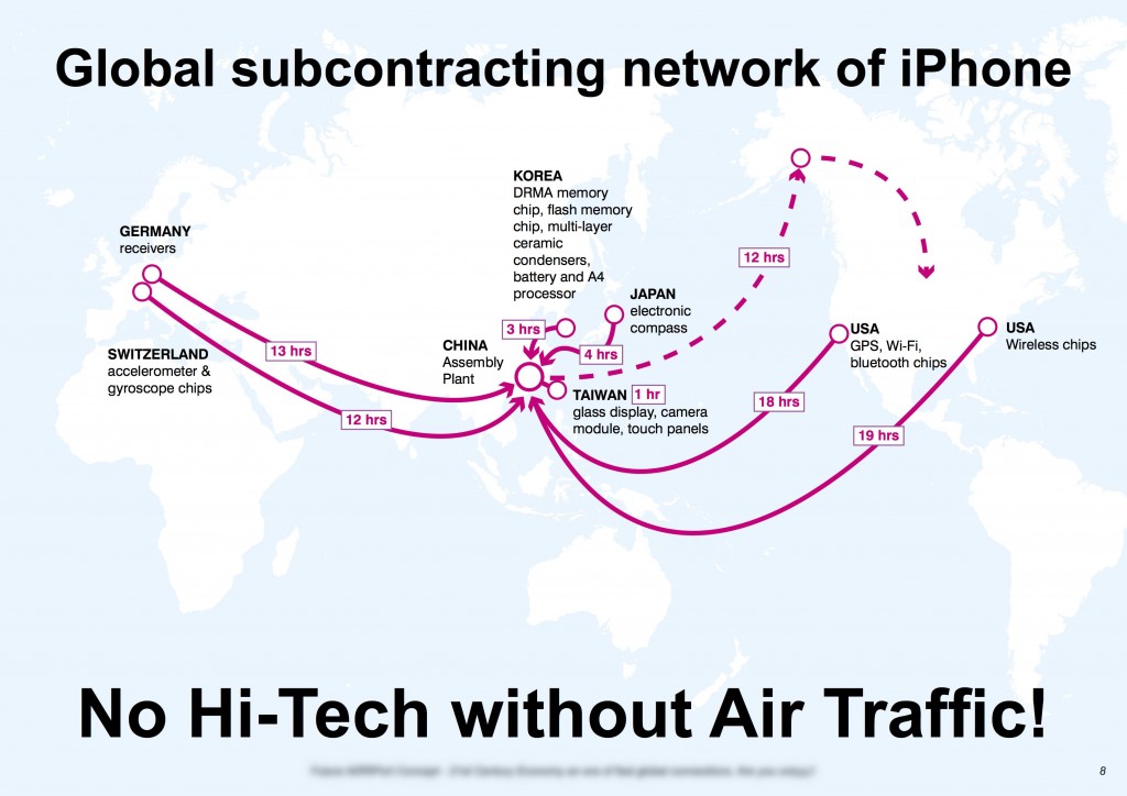
While this example below pleasing to the eye, it is not an optimal support for a presentation. Without any animation, this visual is designed for consumption at the READER’S pace. This attracts the audience to read the graphic while listening to what the presenter says. Research shows that multitasking and switching between tasks has a toll on productivity and learning results.
Based on my experience, graphic designers often take what they have used to do in print design and try to transfer that directly to presentations. Yes, they share a lot of qualities, but there are big differences too. Some further reasons why the example above is not an optimal presentation graphic:
- Some of the text is to small to read especially in larger presentation rooms
- There is too little color contrast on the world map. The whole background will be white if you have an old projector or you cannot dim the presentation room
By principle presentations should be designed for consumption at the SPEAKER’s pace and to serve the presentation environment.
Now the presentation landscape is becoming more fragmented with new mediums like touch screens, webcasts and web meetings. Therefore you want your partner more than ever to know how to adapt his design for the presentation medium.
Designer needs to adapt to customer’s tools not vice versa
The biggest annoyance, at least for myself, has been the reluctance of graphic designers to work with PowerPoint. ”You cannot create anything nice with PowerPoint” or ”I don´t use PowerPoint” are some of the typical answers you can get when you try to hire a graphic design professional to work with aa presentation.
It is like you would hire a carpenter who says that he won´t use hammer, but he rather uses glue.
If you go and play by the graphic designers rules, you will get PDFs or images that may look nice at the beginning. Whenever you want to make a small edit – update a number or change a color – you do not have any control. You will need to ask for each and every little edit from your graphic designer, which makes it impractical to use the presentation.
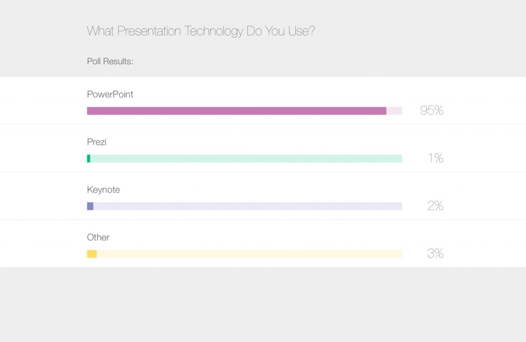
Here´s a screenshot that I took from a webinar a year ago. There were 450 voters from different walks of business – sales, HR, education etc. 95% use PowerPoint.
When this is the world and reality we are living in, why should the presenters (customers) adapt to the designers (service providers) tools?
[ctt title=”Presentations are the biggest business to business medium in the world.” tweet=”Presentations are the biggest business to business medium in the world.” coverup=”vM0f6″]
The meaning of this is not to downplay the profession of graphic designer, but I think that graphic designers should level up their game to serve presenters better.
And as long as they don´t, you as a presenter may run into problems if you are not aware of the typical pitfalls.
If you enjoyed this, here is some further reading about presentation design


