Ten years ago, when somebody mentioned me the term ”presentation”, the first thing appeared on my mind was traditional Microsoft PowerPoint presentation which has ruled since 1987. But that’s not the case anymore. New presentation design tools have sprung up recently and people are now getting familiar with modern presentation tools like Prezi and Powtoon.
And now, in this ever-shifting trends of technology, people started to develop software or tools to design better. They say that designing presentations is now so easy that even a non-tech person can easily create artworks in a few clicks. As a presentation designer, I reviewed three modern presentation softwares: Slidebot, Ludus and Canva.
Could these tools beat PowerPoint and is designing effective and unique presentations really so easy as they promise?
SLIDEBOT
The idea of Slidebot is creating fast and simple slides that meet the needs of the speakers. Basic idea is that user writes the texts and Slidebot chooses the suitable images for each slide. Sounds great, does it?
My first impression was good. Slidebot is incredibly fast to analyze the slides. It took only 20 seconds to analyze ten slides for me. Effective, I say!
But, first impressions are often wrong. And that was the case with Slidebot. Yes, Slidebot is fast but the offered photos are not so useful. The photos are various, but only the first two rows are actually useful. And the lack of connection in style between photos is quite annoying.
Normally, you have to choose the photos again and then it is not fast or effective anymore.
Secondly, Slidebot offer little possibilities to edit the slides. For example you cannot create event the simplest shapes in Slidebot. The shape tool is a powerful one to make impressive presentations and it is a big minus for me that Slidebot doesn’t have it.
Basically, with Slidebot you can change the text and the image and that’s it.
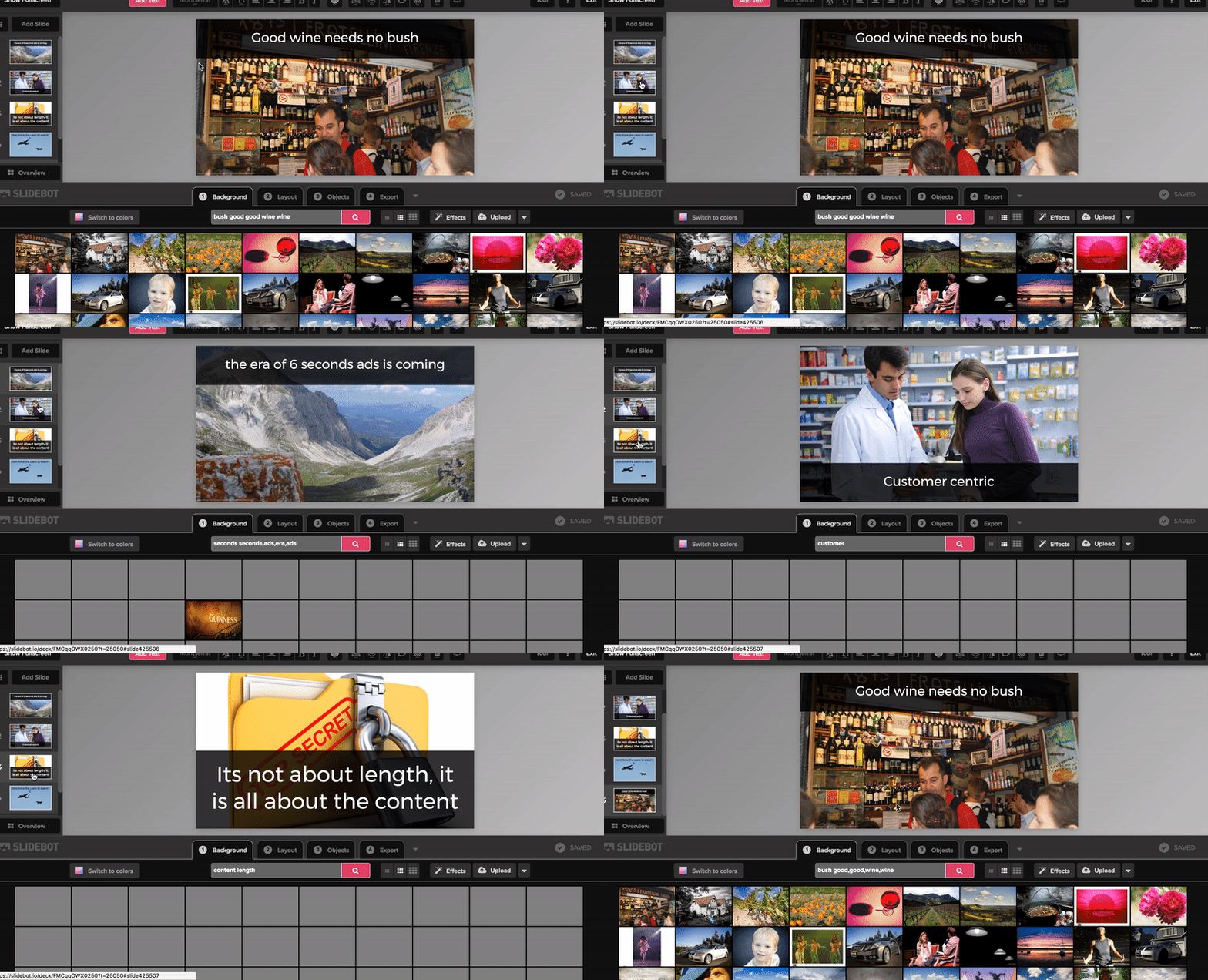
I think that Slidebot is a perfect solution for the speaker pursuing PECHA KUCHA style (also called 20 x 20). 20 slides maximum, 20 seconds each.
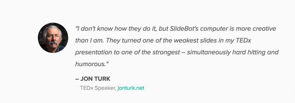
The slides are mostly plain photo to highlight the speech and that may be the reasons why SLIDEBOT is recommended by TED-ex community.
Simple is good. Sometimes. In my opinion, if you are seeking software that creates more professional and convincing slides, Slidebot is not a suitable option for you. With the price $19 per month and $179 per year, I would expect more from Slidebot to worth it.
I appreciate Slidebot for their new technology. Slidebot develops an AI to read and analyze the connection between given text and photos to choose the most suitable ones. However, as I stated above, they are plain and simple.
I think that, Slibebot can’t replace PowerPont or presentation designers. Slidebot presentations might be suitable for very simple presentations, but with even a little bit more complex this tool won’t be enough.
SCORE: 2/5
LUDUS
I got an invitation to test the trial version of Ludus, tool that aims at being the single destination for content creation and sharing, by gathering the best of the web in a simple and intuitive tool for everyone. Sounds promising, right?
Event thoug Ludus says that it is not just about beautiful slides, I reviewed this tool from presentation design point of view. And I was instantly impressed by the layout of the app. It is simple, yet beautiful and strong with the black background.
The layout of Ludus is the combination between Sketch, which are already famous with their user-friendly interface, and traditional PowerPoint.
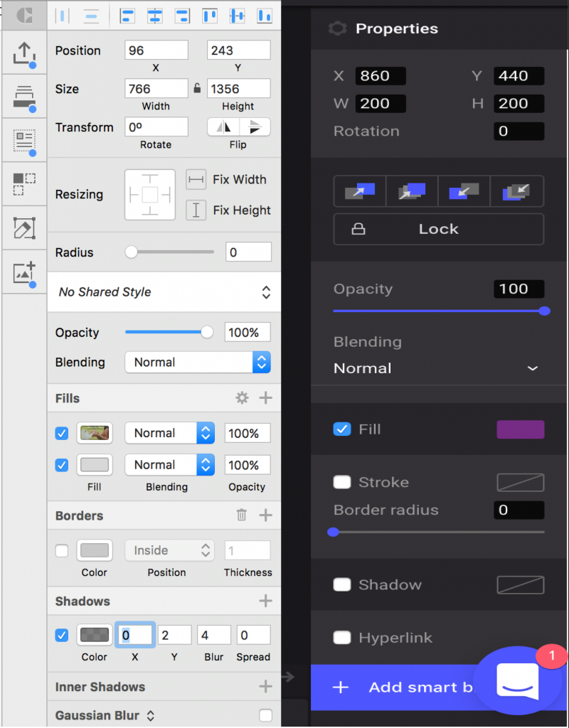
I do think that I could create a good presentation template with this app because they give me some advantages that I have longed for in PowerPoint. Here are few pro’s:
1. SHORTCUTS
Before trying out Ludus, I was working with PowerPoint and I was hoping for shortcuts for picking up colors and switching between colors in shapes and text as in Adobe Illustrator. Even though PowerPoint has a plenty of shortcuts, these you have to do manually.
With Ludus, all objects and actions have a shortcut and it stays right at the bottom of the screen. Powerpoint does not directly appear the shortcuts options, users have to ”right click” to find out. But it takes about 0.5 seconds to learn how to use the shortcuts in Ludus because they are shown clearly on the screen.
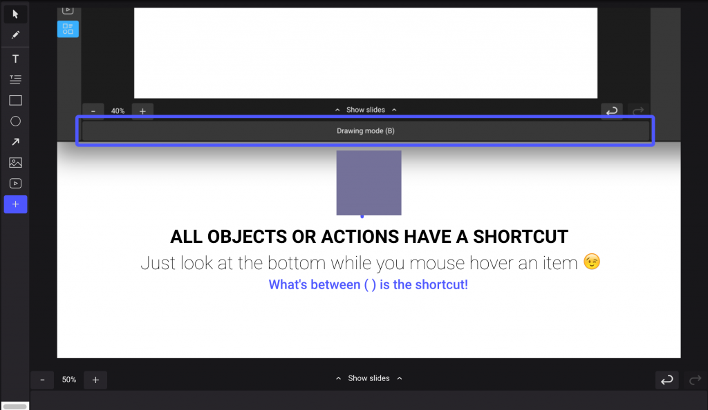
Isn’t it wonderful?
2. LOCK LAYERS
It is kinda hard to view the layers in PowerPoint using Selection Pane tool, especially if you are not familiar with it.
With Ludus, not only layers can be seen easily, but they can also be locked to edit them better and quicker. In PowerPoint, there is not such a thing and that is one reason, why I think Ludus is a combination of PowerPoint and Sketch.
3. UTILIZE FOR SHARING
Sharing Ludus presentations to your co-workers, friends or customers is easy: just send them the URL and they can view, and if you want, edit the presentation easily. You don’t have to send files and hope for compatible versions and same installed fonts like with PowerPoint.
You end up exporting the file as PDF, losing all the animations and interactive objects (like videos), and resulting in a boring flat file.
Vicent, B- said about PowerPoint cons
Even though Ludus seems very good presentation design software, it still has a long way ahead if it wants to compete with traditional PowerPoint. PowerPoint provides many options for shapes to express users imagination and needs, and recently, the new version of Powerpoint has developed the ”Path finder”, which helps users create shapes as easy as Adobe Illustrator.
And most of all, it is better if Ludus presentation can be exported as editable PowerPoint. Because still, many people prefer the traditional option.
The price of Ludus is $99 per year. I think it’s quite expensive with the current features, but they say there are more features coming up. In the future, I believe this tool will be more effective in the future and it will be a good competitor to PowerPoint.
If you want to read more about Ludus, check this interesting post on Medium.
SCORE: 3.5/5
CANVA
The last tool I want to mention in this post is Canva. Canva, with only 5 years of development, has made an incredible soar in the market.
Canva has hundreds of thousands of templates and samples for users needs. They are various, high-quality and unique.
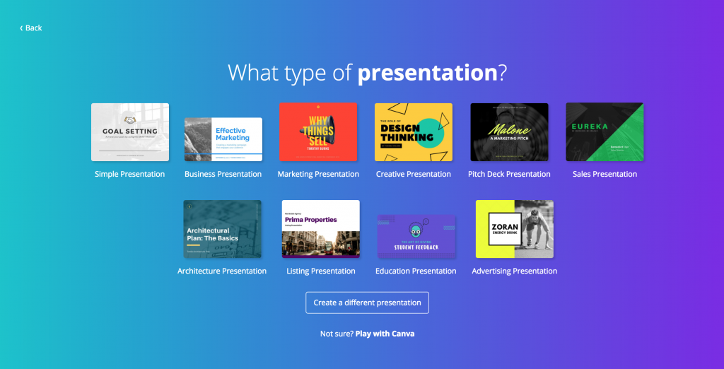
You can easily find presentation templates in Canva. You can choose from free and paid templates and there are two options available: widescreen (16:9) and in normal. In the left corner of the screen, users can access to Canvas’ elements library. Choosing the best template is probably the hardest task since there are so many templates where to choose.
With five minutes spent on Canva, you can easily create 5 to 10 slides based on their templates. Canva is extremely useful and handy because everything in the template slide is modifiable.
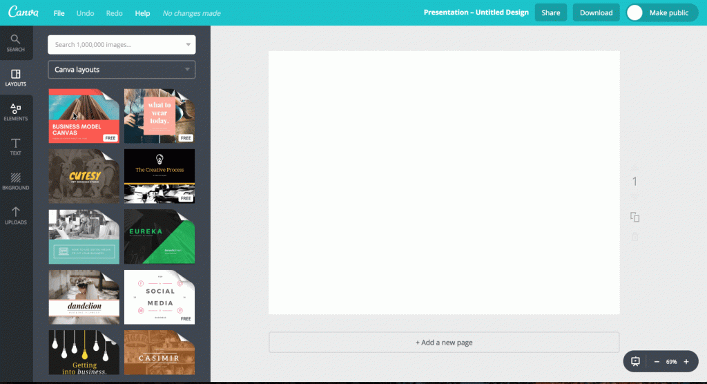
However, Canva is a superb in image design but it cannot provide animated video features. Animation creates the logical connections between slides and Canva don’t have it. Moreover, it is hard to create charts and tables in Canva. The export options are narrowed, only jpg, png or pdf. Therefore, I believe with the business purpose, you don’t want to use Canva to create your pitching presentations.
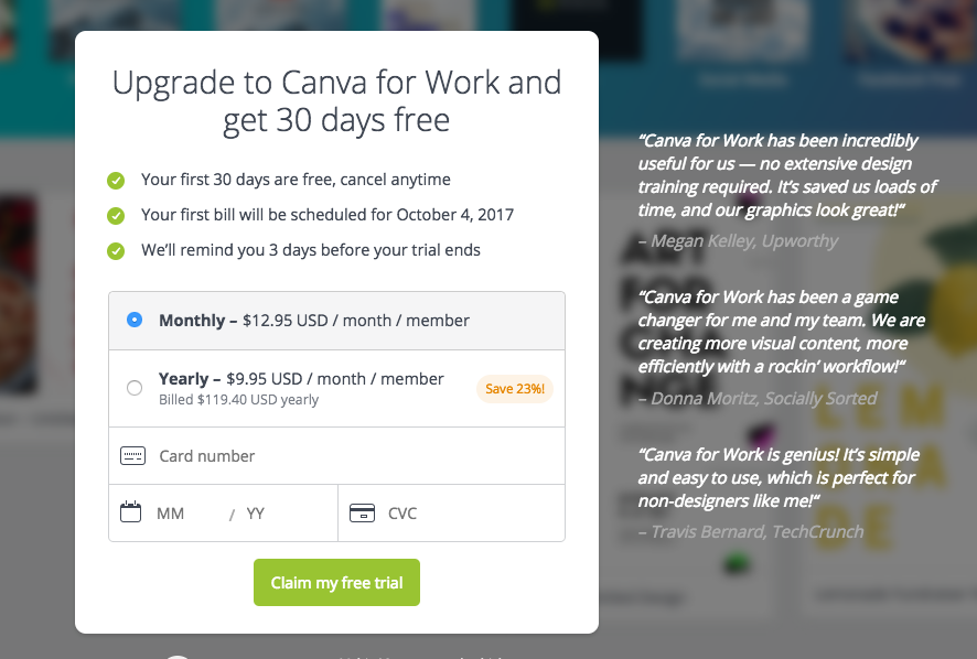
You can find Canva also from Appstore to support their users on any devices. The price of Canva is 119.40 $ per year. Canva is quite expensive, but if you want to create beautiful, yet simple presentations and illustrations with an easy, this could be the tool for you. As I mentioned before about their wonderful elements library, some of them are free, however, users have to pay around 1$ for each element added if the elements are charged by the creators. Therefore, with the premium plan of Canva, you have a right to access with paid elements and templates.
SCORE: 4.5/5
To sum up, we have this
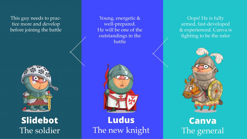
All in all, these tools are great but they cannot replace presentation designers at the moment.
These tools provide many handy features but they lack the most important one:uniqueness. You probably don’t want your pitching presentation for investors to look exactly the same as someone else’s in the room.
Effective presentations should not only be visually attractive, they also need to be functional, logical, unique and create a strong impact. And for that, we still need designer to figure out.
I would still chose PowerPoint as the main tool for my work. The new version of PowerPoint with 3D features will be presented towards users soon, and it is worth waiting for. While we wait that, you can check few useful PowerPoint tips here.
Have you tried out presentation tools to ease presentation design? What are your experiences? Share your favourite tool for us below or on Twitter or LinkedIn!

