”What´s the next big thing after PowerPoint?” That is a question I get asked often. Seems like people are eagerly waiting for a new tool that would save us all from ”Death by PowerPoint” presentations. Or maybe it is just that people fancy new things and ideas – PowerPoint has been around for almost 30 years already.
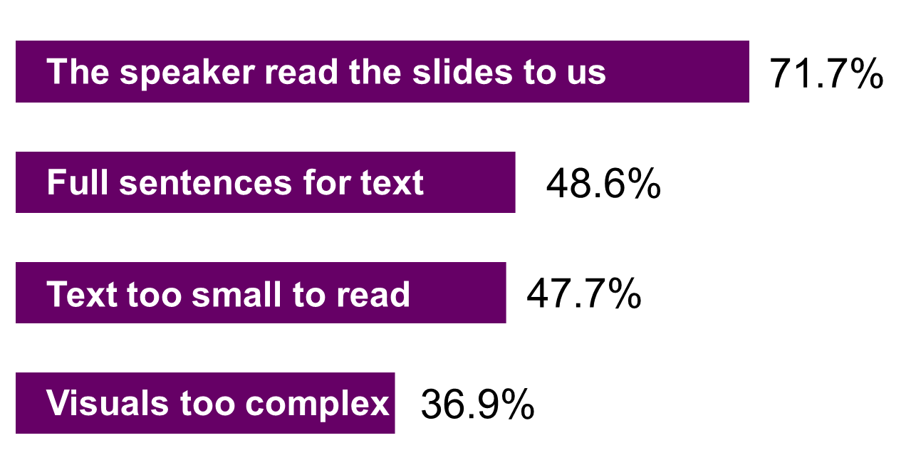
Let´s first explore the question why PowerPoint should be overthrown? Dave Paradi´s Annoying PowerPoint Survey 2015 gives some insight to what annoys people the most about PowerPoint presentations.
1 – PowerPoint presentations contain too much text

Based on the top4 issues with PowerPoint presentations it seems that PowerPoint allows too much text for presentations. Audiences don´t like to multitask between reading presentation slides and listening to the speaker. And that is good thing, since not forcing audience to read and listen at the same time makes a more brain-friendly presentation.
So the perfect successor for PowerPoint would make either make it super easy to turn text into visuals or it would not allow to write on presentation slides.
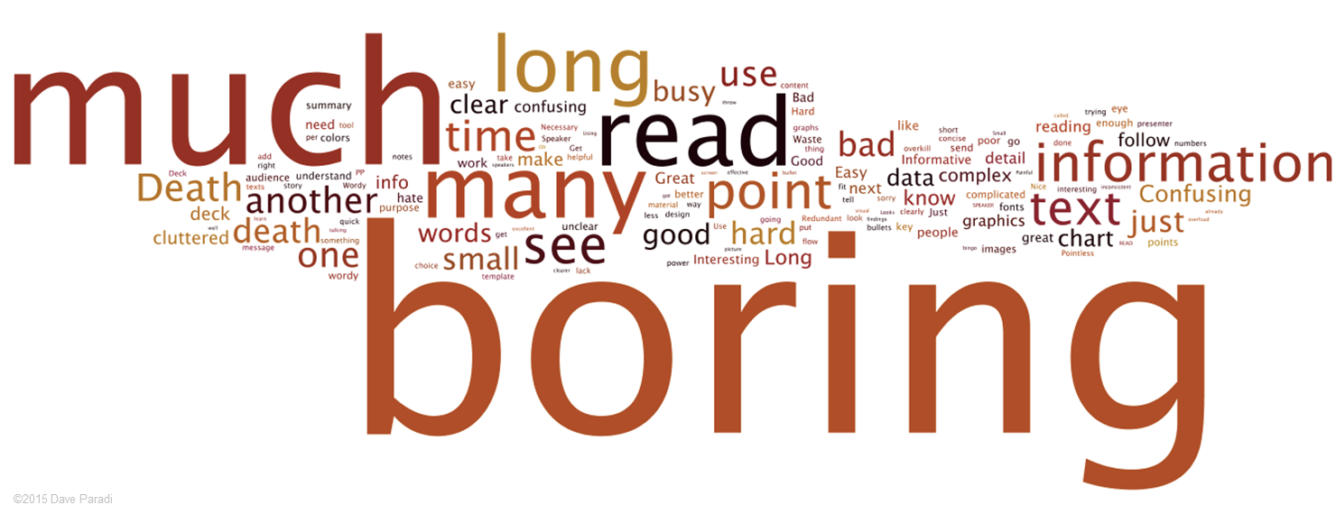
2 – PowerPoint presentations are boring
Here´s another interesting finding from the same survey. The words or phrases that people hear most often when they talk about PowerPoint presentations in their organization.

What makes a presentation interesting then? I often ask people in my workshops to tell me what is a good presentation like in their opinion. Seven characteristics that stand out are
- Simple
- Relevant
- Tailored to audience needs
- Visual
- Interactive
- Stories
- Distinctive
The funny thing is you can achieve almost everything from that list without any presentation graphics – be it PowerPoint, Keynote or Prezi. Almost everything from that list is a question of proper preparation.
3- PowerPoint dominates the presentation landscape
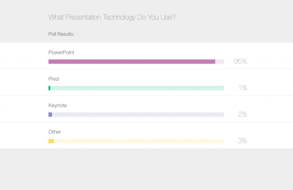
Here´s an screen capture from a webinar I attended a year back. This poll result shows that PowerPoint is the dominant presentation graphics program. Prezi – although it has garnered quite some attention – has not made people flee PowerPoint in droves. Keynote commands a mere 2% of the presentation market. The rest share remaingin 3%.

Since most of the presentations are given using PowerPoint, then most of the bad presentations are also given using PowerPoint. It may be that people that are more aware of what they want and need from presentation graphics have gone to explore new hunting grounds. Therefore it appears that some other tool does a better job, even when it is actually more about the presenters being more knowledgeable about preparation process and well-designed presentation graphics.
So the prefect successor for PowerPoint would
- Not allow to write a lot of text on slides or it would easily turn text into visuals
- Give guidance to the presenter on how to make the presentation content more interesting and distinctive
- Be something else than PowerPoint – a shiny new thing
None of the PowerPoint alternatives that have hit the market during the last 2-3 years have been able to provide a solution to nr 2. Based on my own experience Haiku Deck is closest to the perfect solution for 1 and 3.
But the fact is that PowerPoint still remains dominant. So…
4 – What does it take to overthrow the king?
I predict that when a PowerPoint challenger can achieve these three things – then we can see a greater shift in the presentation landscape.
1. A big hardware innovation
PowerPoint came around when personal computing industry emerged in mid 1980s. After that we have not seen a huge shift in how we use hardware. All of the devices that we use to create and deliver presentations are pretty much combination of a keyboard and a screen. When we shift the way we use computers (e.g. wearables) then we can shift the way we make presentations.
2. Network effect
One of the features that PowerPoint’s challengers often overlook is the network benefit of PowerPoint (and Office Suite). The more people use the same software, the easier it is to collaborate. Thanks to Office suite’s huge penetration in companies and schools, PowerPoint is lot more valuable than using a separate software for presentations.
3. Not too odd
People yearn for new things, but not too new. For example, Prezi’s infinite canvas, paths and screens can be too far-fetched for most presenters. The best innovations make it smooth to shift from old to the new. In case of presentations PowerPoint’s slides are just a substitution for overhead transparency films and 3.5 mm slides. It was not difficult to persuade people to use the software when it was based on something that people were already familiar with.
5 – So what comes next?
My prediction is that we will see something new coming when virtual reality and augmented reality become mainstream. It is a big hardware innovation that could provide opportunities for whole new players. This Microsoft Holo Lens video is a great example of what we can expect to presentations to be like in the future – and we can expect Microsoft to be around for the future too.
But before that is reality, let´s make the most out of PowerPoint.
